 |
"Folly Sunset" 5"x 9.25"
Watercolor $125
|

Value, Hue & Inspiration. Understanding the creative journey.
Showing posts with label Works in Progress. Show all posts
Showing posts with label Works in Progress. Show all posts
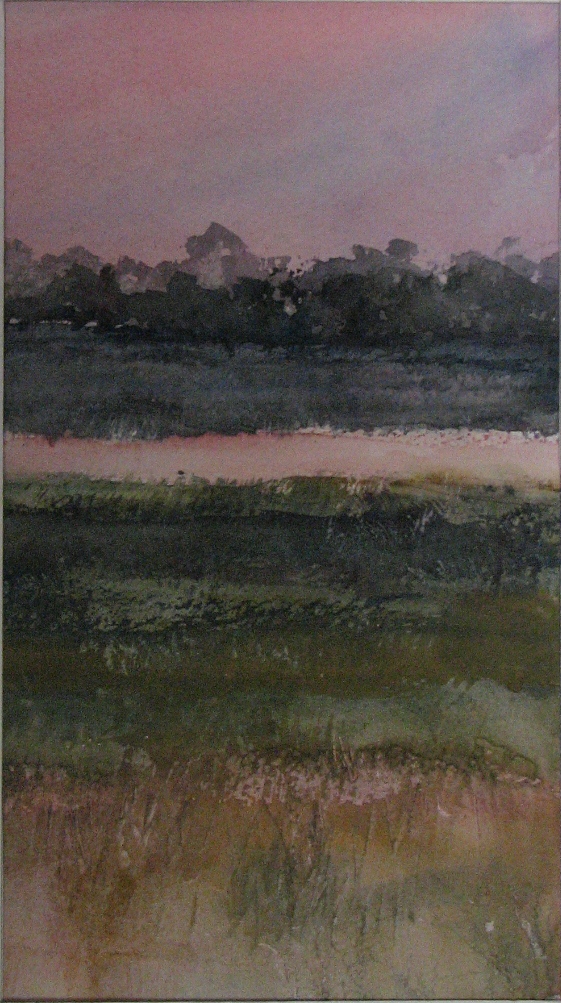
Wednesday, June 27, 2012
Study for Folly Island Marsh Scene
Working on several small studies for a larger marsh scene I want to paint. The smaller pieces allow me to work out my palette and play around with different techniques and textures. I've kept my palette very limited at this point, with a cool dominance. Using: Winsor Blue (red shade), Winsor Blue (green shade), Cobalt Blue, Cerulean, Raw Sienna, Aereolin, Rose Madder Genuine - all Winsor Newton brand. I have not used masking fluid, but lifted or scraped in the highlighted grasses. No detail has been put in at this point. I'm really just exploring the subject matter and trying to keep it loose and suggestive, letting my impression of the scene come through. Thinking of trying out a slightly different color palette to see if I can get the feeling of more distance. Also noticing that the values are mainly in the mid-range and I will need to develop a full range of values in future studies.
Wednesday, March 14, 2012
Following the Muse - Experiments with Gelatin Printing
 |
| gelatin monotype on mulberry paper |
So, I have been playing. And it's been contagious, because I have others playing now too. Truth be told, I caught this bug after doing some serious research on varied methods for experimental watermedia and it has been the most fun that I've had doing anything in a long time. (except for spending time with my sweeet sweet 5 month old golden retriever, Lily) I am refering to Gelatin Printing. There is something about this process that has just intrigued me. Maybe it's the unpredictable nature of the printmaking process, maybe it's the organic feel to the gelatin plate, but I am hooked, mesmerized and totally in love with the process. And me, a watercolor painter and a pretty representational one at that. Go figure. But art is not restrictive...shouldn't be. And so, the playing, the exploration of other methods and other mediums. Following the muse.  |
| gelatin monotype on mulberry paper |
So. Ready to explore? Go for it. Experiment. Let your hair down and have some fun.
Wednesday, November 16, 2011
Farmers Market Painting - Step by Step update
Continuing with the Step-by-Step blog entries for the Farmers Market painting demo for the Tuesday afternoon and evening class, but making a new entry today. To see the painting in it's initial stages see the following post: http://nancybarrywatercolorblog.blogspot.com/2011_09_01_archive.html
The last 2 weeks have been geared toward completing the Squash paintings. Shown here are mid to late stages on most of the painting. Have begun to add most of the dark recesses behind and between the vegetables and have added several shadows which serves to pull the painting together and to pop many of the objects forward. Finishing details are still yet to be added.

The last 2 weeks have been geared toward completing the Squash paintings. Shown here are mid to late stages on most of the painting. Have begun to add most of the dark recesses behind and between the vegetables and have added several shadows which serves to pull the painting together and to pop many of the objects forward. Finishing details are still yet to be added.
 |
Worked on the purple-ish stem on this particular carnival squash. Typical to the watercolor process, I added the lightest washes first, and then built up the detail and shadows. I might still add some textural effects by 'stamping' with my thumb or index finger picking up some of the ''palette wash' and applying it to the stem. The pigments I used for the stem included: Rose Madder, Burnt Sienna, Cobalt Blue. |
 |
I added a cerulean and burnt sienna wash to the top surface of the crate's sides to mimic light reflecting off of the dark black plastic of the crate. I washed in a cerulean underglaze on any of the surfaces that I thought would reflect light, particularly in the corners and crevices of the 'vents' on the sides of the crate and to the inner areas of the handles. After the underglazes were dry, I went ahead and mixed up a thick soupy dark mixture, bordering on the blue/black, and painted the remainder of the crate. Pigments used to create the blue/black included: french ultramarine, antwerp blue, alizarin crimson and burnt sienna. Lastly, I shadowed the inner areas of the crate vents and handles (not shown in thie view) |
 |
To the stem I washed in a cerulean underglaze, let dry and then glazed over this with antwerp blue, rose madder genuine and/or aureolin yellow, depending on whether I needed a purplish or greenish wash, often mingling the 3 directly on the stem. (photo below) Since these pigments are all transparent, non-staining, they do not create 'mud' but a beautiful transparent jewel-like combination. After the second wash was completely dried, I began to 'lift' highlights and details with a clean damp brush. (not shown here) |

 |
Added darks between the vegetables using combinations of ultramarine, burnt sienna, and occasionally adding alizarin crimson and/or antwerp to punch up the intensity of the dark. Added shadows behind the slate chalkboard in the top right of the painting to pop the chalkboard forward and push the vegetables back in the composition. Worked on the stems of the spaghetti squash which I will post shortly. Still need to work on pushing several areas 'back' to create more depth and I need to complete the wood surrounding the chalkboards as they are still only showing the initial underglaze. Textural details to the skin of the squash, stems and possibly chalkboards will be added after a final evaluation. |
Subscribe to:
Posts (Atom)