Thursday, September 22, 2011

Tuesday night watercolor class - Painting in progress


Nov 5 Update: Continuing to develop the painting, I carefully observe the variety of greens and yellows that create unique patterns over  the carnival squash. Using several yellows and a variety of earth tones, I allow the pigments to mingle directly on the paper, rather than overmix on my palette. You can see where I have dropped in burnt sienna and sap green in the warm yellow/gold washes. I continued to develop the green pattern, varying my greens from warm to cool, and again letting many of the pigments marry directly on the paper. I am working here on dry paper, as these patterns are abstract and have crisp hard edges that can only be retained by keeping the paper dry and applying wet washes and pigment directly to the watercolor drawing. I am also keeping the lighting direction, tonal value change and the overall form of the squash in mind as I paint and deepen or lighten the values as necessary.  


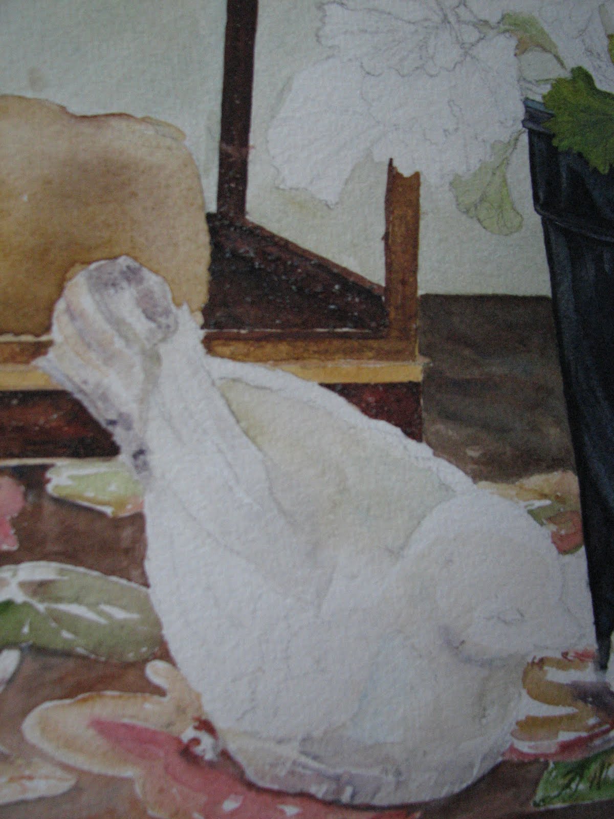
Started the Tuesday night Watercolor classes up again for the Fall and have everyone working on a Farmers Market theme. Everyone had a great start to their paintings on Tuesday night and I'm looking forward to seeing the progress of each painting next week. Will take some photos of student work and post when I get a chance. Here is what I am working on and will demo on for the class. At this point, I am just getting started. I laid in most of the soft yellow washes for the squash and have started defining the most prominent object in the foreground, shown in this photo. In the overall shot, you can see that I have also dropped in one of my darkest darks - the chalkboard. Although this is not the darkest dark in this composition, laying it in early in the painting process allows me to really get a handle on the overall tonal value of the painting. In other words, I have something to compare adjacent areas to. I like to get some of my darks in early, rather than waiting till the end. This way, I can work towards the correct tonal values all throughout the painting process and do not have to worry toward the end that I have to make drastic adjustments. For me, it's the way I balance my painting.


Wide shot of painting-in-progress with the inspiration photo taken at the Chicago Farmers Market clipped to board. Note: this is very early in the painting process. Pigments I am using: Raw Sienna, New Gamboge, Aereolin, Quinacridone Gold, French Ultramarine Blue, Winsor Blue, Sap Green, Rose Madder Genuine, Alizarin Crimson and Burnt Sienna.  


Thursday, September 15, 2011

New Blog Format

Yes, my blog format has changed! I loved my old blog, but it was not very user friendly for visitors. In visiting several other blogs, I noticed that many of the bloggers were using this format, and so, I decided to make the switch. Hope you like it and hope you find it friendlier to work with.

Experimental Watermedia - Monoprinting

I am a very structured watercolorist. I think that everyone who knows me will agree to that statement! That being said, I love the unexpected and exciting things that happen in watercolor when you least expect them to happen. I think this is part of what keeps me coming back to this medium. These are what seasoned watercolorists call "Happy Accidents". What better way to grow creatively than to play with your medium and let these 'accidents' happen on purpose? Below is an example of a day of experimenting with my medium. The main thing is to have fun, wear gloves (I didn't and had interesting 'nail polish' for several days), and work outside!! I found doing this to be very freeing and unexpectedly rewarding. I hope you do too!
 
Using 300lb Arches watercolor paper I layered cheesecloth, peppercorns, riverrock and various grasses on top of the watercolor paper. Be sure to cover your entire area with plastic. I used dry cleaning bags that were opened up, but you could use large lawn and leaf bags if you don't have dry cleaning bags.

I poured several watercolor washes over the paper/materials beginning with the lightest color first and working toward my darkest colors. I also added sea salt to selected areas. I kept to a minimum of colors here, knowing that the final mixture could get muddy. The colors I chose were transparent with the exception of cerulean blue, which is opaque. I kept the opaque cerulean almost off to itself, although I knew there would be some mingling. After the pours were competed, I folded the remaining plastic over the paper and placed a large piece of tempered glass on top to weight everything down. I let this dry almost the entire day, unfolded, unwrapped and removed the items placed on top of the paper (with care) and brushed off the areas where salt was added to the pour.  
Close-up of cheesecloth and peppercorns.
Finished piece before all materials are removed. You can see the pattern the cheesecloth leaves (brown-ish area, middle left).


Finished piece - mixed media. Materials used were similar to the above, except I changed out the river rocks for shards of clay pots and sea shells.

Sea shells, clay pot shards, weeds, cheesecloth, salt, watercolor and acrylic metalic paint.
Close-up of pottery shards pushing up against cheesecloth that has been stained by the watercolor poured over it.


Thursday, September 8, 2011

Painting Deconstructed - Geranium Still Life


<>
Fig 1
Here is the still life on my porch that the Spring watercolor class worked on in the gallery. I start with a detailed drawing and then begin to add my darks, being careful to cut in with my brush around any of the shapes that overlap the darker forms. I usually jump right into developing the darkest areas and/or forms on my paintings as this sets the 'tone' of the overall painting for me. In figures 2 and 3 you will see that compared to the rest of the painting, these areas look very dark. At this point in the painting I try to establish many of the middle values. (You will see in later images that the dark in the plastic flower pot at this stage, become its highlights and middle values.)

For the flower pot, I mixed a fairly thick wash of ultramarine, alizarin crimson and burnt sienna (a good black) and applied this to the pot, all the while being mindful that the pot, although dark, still had many highlighted areas where the light was hitting it. I dipped my brush into cerulean blue and charged this color into the wet 'black' in areas where I wanted 'highlights'. I let this dry completely.


The rust texture on the roof of the lantern was created by first laying in a glaze (wash) of raw sienna, which I let dry completely. Then I mixed up a thick soupy mixture of burnt sienna and french ultramarine and washed that over the entire roof area, (being careful to stop at the 'seams'). While this was was wet, I threw a generous amount of kosher salt onto it in no particular pattern and left this area to dry thoroughly for 1 day before I brushed off the salt. This photo reveals the texture that is left behind without any touching up or altering on my part.


As the lantern and flower pot are drying, I begin to develop the stems and form of each one of the leaves on the geranium. Again, I am laying in the paint in glazes on the leaves, meaning that I am laying in an 'underwash' or 'glaze', letting this dry and then going back in with another wash (or glaze) and developing the recessed and folded areas of my leaves. I'm careful to paint 'around' the veining in the leaves. I drew these 'directional veins' in when I did my preliminary drawing. (not every vein, but enough so that I had an idea of how the leaves were growing and turning toward the sun)

For the stems, I wet the entire stem with clean water and dropped in my yellows and blues, and then hit it with a tad more clean water and let them 'run' and 'mingle' on the paper and let this dry. I find this makes for a nice natural stem look. Later I come back to define the shadow side of the stems more. But not till much later...


As the painting develops, I have moved around and worked on various areas surrounding the bird scuptures. I have painted in the tablecloth, in stages, so that I can retain hard edges where I need them and let the color in other areas 'merge' using soft edges (as in the flower shapes on the tablecloth). All the while my focus is on developing FORM in each object, through the use of TONAL VALUE.  As you can see in the two images at left and right above, I begin to move into developing the birds in the very same way, glazing carefully where I see color being reflected onto them from the tablecloth, from the pot and from the sunlight that is cast over the scene. Since these are essentially 'off white' I have to look carefully to see the colors that are reflected onto them, but these reflected colors and shadow tones are what make up the form of these birds. I always try to repeat the colors I use elsewhere in my paintings so there is unity, so I used raw sienna glazed by itself, the purpley-black mixture of ultramarine/burnt sienna/aliz crimson in some of the shadow areas and where the pot reflects, burnt sienna glazed by itself, and cerulean blue by itself, again, in the shadow areas.

The plastic pots have been developed further. Now you can see how the intitial washes that looked so dark at the beginning of the painting, are now 'reading' as highlights and middle values. I have used hard edges (cut in with my brush and maintained crisp, hard edges) to define where the light hits the pot. To do this I painted AROUND the light areas that I wanted to keep (negative painting). You have to keep focused and imagine the space you are painting around or you can lose the highlight you worked so hard to establish. I also did some LIFTING to the pot edge on the top, near the leaves and to the lips where the pot rim and the belly of the pot meet. I want to define these edges so we can see the form of the pot and the planes that make it up.

I will show additional stages and the completed painting in a future blog post! Still working on completion..mainly working on individual leaves and adjusting my tonal values throughout the composition.