Wednesday, November 16, 2011

Farmers Market Painting - Step by Step update

Continuing with the Step-by-Step blog entries for the Farmers Market painting demo for the Tuesday afternoon and evening class, but making a new entry today. To see the painting in it's initial stages see the following post: http://nancybarrywatercolorblog.blogspot.com/2011_09_01_archive.html

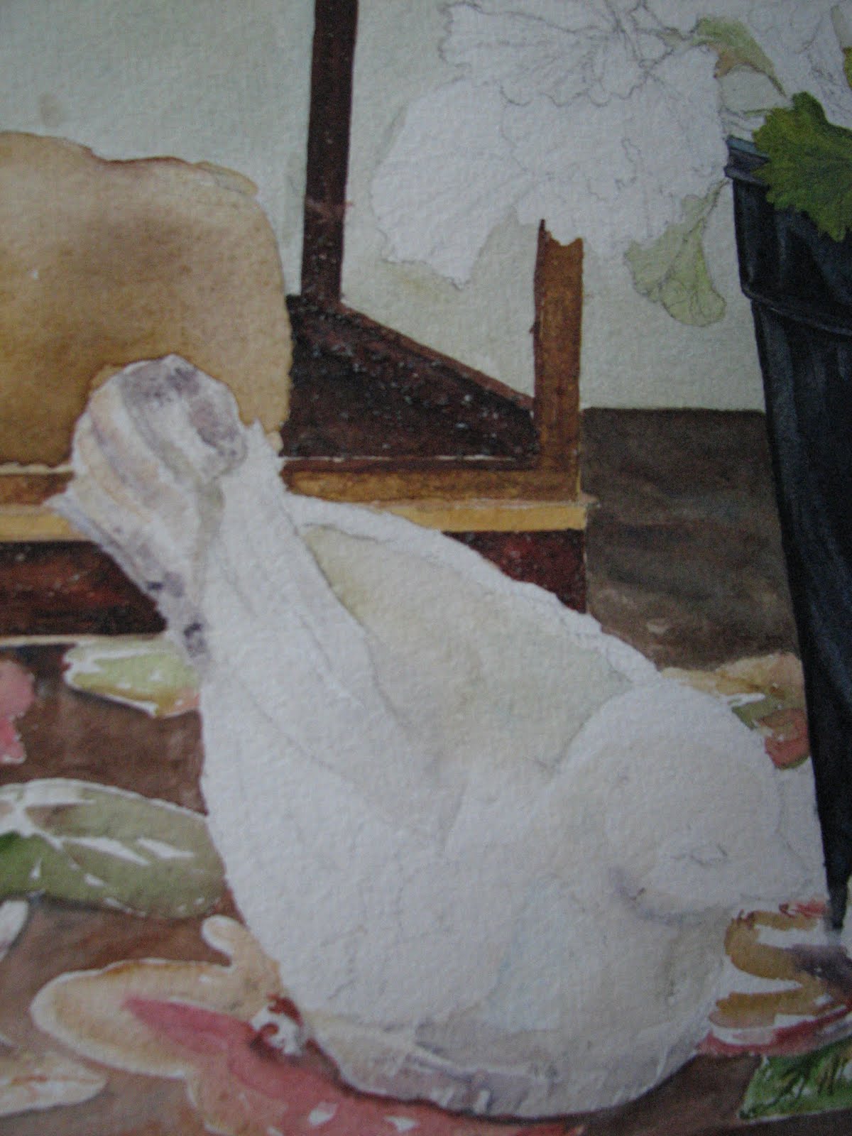
The last 2 weeks have been geared toward completing the Squash paintings. Shown here are mid to late stages on most of the painting. Have begun to add most of the dark recesses behind and between the vegetables and have added several shadows which serves to pull the painting together and to pop many of the objects forward. Finishing details are still yet to be added.

Worked on the purple-ish stem on this particular carnival squash. Typical to the watercolor process, I added the lightest washes first, and then built up the detail and shadows. I might still add some textural effects by 'stamping' with my thumb or index finger picking up some of the ''palette wash' and applying it to the stem. The pigments I used for the stem included: Rose Madder, Burnt Sienna, Cobalt Blue.


I added a cerulean and burnt sienna wash to the top surface of the crate's sides to mimic light reflecting off of the dark black plastic of the crate. I washed in a cerulean underglaze on any of the surfaces that I thought would reflect light, particularly in the corners and crevices of the 'vents' on the sides of the crate and to the inner areas of the handles. After the underglazes were dry, I went ahead and mixed up a thick soupy dark mixture, bordering on the blue/black, and painted the remainder of the crate.  Pigments used to create the blue/black included: french ultramarine, antwerp blue, alizarin crimson and burnt sienna. Lastly, I shadowed the inner areas of the crate vents and handles (not shown in thie view)


To the stem I washed in a cerulean underglaze, let dry and then glazed over this with antwerp blue, rose madder genuine and/or aureolin yellow, depending on whether I needed a purplish or greenish wash, often mingling the 3 directly on the stem. (photo below) Since these pigments are all transparent, non-staining, they do not create 'mud' but a beautiful transparent jewel-like combination. After the second wash was completely dried, I began to 'lift' highlights and details with a clean damp brush. (not shown here)


Added darks between the vegetables using combinations of ultramarine, burnt sienna, and occasionally adding alizarin crimson and/or antwerp to punch up the intensity of the dark. Added shadows behind the slate chalkboard in the top right of the painting to pop the chalkboard forward and push the vegetables back in the composition. Worked on the stems of the spaghetti squash which I will post shortly. Still need to work on pushing several areas 'back' to create more depth and I need to complete the wood surrounding the chalkboards as they are still only showing the initial underglaze. Textural details to the skin of the squash, stems and possibly chalkboards will be added after a final evaluation.

Saturday, November 12, 2011

Frame Warehouse Holiday Open House on Nov. 10th raises over 850 dollars for the Boys Home of the South!

It was a wonderful night at the Frame Warehouse & Gallery Holiday Open House in Greer this past Thursday night! Debbie Beauchemin's never tiring efforts raised over 850 dollars with the final count not in yet. As the economy and in kind donations to charities in general have taken a downturn in recent years, Debbie has risen to the occasion. Each year at the start of the holiday season, she chooses a local charity or organization in need for her Hudson Road shop to raise funds for. In years past, Debbie, who I have a special place in my heart for, has raised several thousand dollars all totalled for organizations such as the Greer Soup Kitchen, the local chapter of the National Association for Mental Illness and this years recipient, the Boys Home of the South. More than 16 local artists, including myself, participated in last weeks fundraiser by donating over $2,000 of artwork and merchandise to the event. Participating artists for this event were: Sandra Roper, Dick Mitchell, Tom Stewart, Edith McBee Hardaway, Michelle Giles, myself (Nancy Barry), Joan Zepf, Sherry Elrod, Stella Schaefer, Judy Taylor, Karl Voss, Andrew and Ruth Banovic, Susan Linn, Richard Campbell, Joanne Reed, Cheryl Bradfute, Danny Carnes, and Gary Roderer.

Artists from left to right: Edith Hardaway (red), Sandra Roper, Nancy Barry

Artists left to right: Danny Carnes (back left of photo), Stella Schaefer (facing)

Artists left to right: Joan Zepf (center)


Artists left to right: Sherry Elrod (back), Judy Taylor (center), Joan Zepf


Left to right: Andrew and Ruth Banovic (left)


Artists left to right: Edith Hardaway (rear left), Joan Zepf, Sherry Elrod and Bill Lester
 As one of the participating artists, I would like to personally thank all of my own friends and family and followers along with Debbie's loyal customers for their generosity and support. We could not do what we do without you.

Thursday, November 10, 2011

Tuesday Afternoon Watercolor Class Pics

Julie and her in-progress painting

Kathy putting some of the finishing touches on her painting.

Bert with her first watercolor painting!
As the holiday season swiftly approaches, the last of my Fall session watercolor classes draws to a close. These photos are just a few from my Tuesday afternoon ladies, who, I have to say, have been a huge amount of fun to work with. Kudos to those in the class who were 'first-timers' to the medium of watercolor! I threw a good bit of information at them and gave them an intermediate level painting subject for their first time out of the gate! Watercolor, when you're a beginner, can often feel like you're tightrope walking without a net, but they handled the process with grace and from what I saw, had a few 'lightbulb' moments along the way. Everyone did a terrific job on their painting. Posted here are 3 of the 5 paintings. Will catch photos of Carol's and Dori's and post an update with their pics next week. Great job all! And thanks to all of you for a very enjoyable 6 weeks!

Saturday, November 5, 2011

Tuesday night watercolor class completed Farmers Market paintings

Here are the completed farmers market paintings from the Tuesday night Fall 2011 class. Photos courtesy of Stella Schaefer.
Radishes and Turnips - Stella Schaefer

Rhubarb - Joan Zepf (almost completed photo)

Japanese Eggplant - Susan Buteau

Rhubarb Study - Joan Zepf

Friday, October 28, 2011

Tuesday Night Painting Class

Stella Schaefer adding finishing detail to painting of radishes and turnips.

Susan Buteau working on a study from the book "Problem Solving in Watercolor"

Joan Zepf discussing her painting with Susan

Thursday, September 22, 2011

Tuesday night watercolor class - Painting in progress


Nov 5 Update: Continuing to develop the painting, I carefully observe the variety of greens and yellows that create unique patterns over  the carnival squash. Using several yellows and a variety of earth tones, I allow the pigments to mingle directly on the paper, rather than overmix on my palette. You can see where I have dropped in burnt sienna and sap green in the warm yellow/gold washes. I continued to develop the green pattern, varying my greens from warm to cool, and again letting many of the pigments marry directly on the paper. I am working here on dry paper, as these patterns are abstract and have crisp hard edges that can only be retained by keeping the paper dry and applying wet washes and pigment directly to the watercolor drawing. I am also keeping the lighting direction, tonal value change and the overall form of the squash in mind as I paint and deepen or lighten the values as necessary.  


Started the Tuesday night Watercolor classes up again for the Fall and have everyone working on a Farmers Market theme. Everyone had a great start to their paintings on Tuesday night and I'm looking forward to seeing the progress of each painting next week. Will take some photos of student work and post when I get a chance. Here is what I am working on and will demo on for the class. At this point, I am just getting started. I laid in most of the soft yellow washes for the squash and have started defining the most prominent object in the foreground, shown in this photo. In the overall shot, you can see that I have also dropped in one of my darkest darks - the chalkboard. Although this is not the darkest dark in this composition, laying it in early in the painting process allows me to really get a handle on the overall tonal value of the painting. In other words, I have something to compare adjacent areas to. I like to get some of my darks in early, rather than waiting till the end. This way, I can work towards the correct tonal values all throughout the painting process and do not have to worry toward the end that I have to make drastic adjustments. For me, it's the way I balance my painting.


Wide shot of painting-in-progress with the inspiration photo taken at the Chicago Farmers Market clipped to board. Note: this is very early in the painting process. Pigments I am using: Raw Sienna, New Gamboge, Aereolin, Quinacridone Gold, French Ultramarine Blue, Winsor Blue, Sap Green, Rose Madder Genuine, Alizarin Crimson and Burnt Sienna.  


Thursday, September 15, 2011

New Blog Format

Yes, my blog format has changed! I loved my old blog, but it was not very user friendly for visitors. In visiting several other blogs, I noticed that many of the bloggers were using this format, and so, I decided to make the switch. Hope you like it and hope you find it friendlier to work with.

Experimental Watermedia - Monoprinting

I am a very structured watercolorist. I think that everyone who knows me will agree to that statement! That being said, I love the unexpected and exciting things that happen in watercolor when you least expect them to happen. I think this is part of what keeps me coming back to this medium. These are what seasoned watercolorists call "Happy Accidents". What better way to grow creatively than to play with your medium and let these 'accidents' happen on purpose? Below is an example of a day of experimenting with my medium. The main thing is to have fun, wear gloves (I didn't and had interesting 'nail polish' for several days), and work outside!! I found doing this to be very freeing and unexpectedly rewarding. I hope you do too!
 
Using 300lb Arches watercolor paper I layered cheesecloth, peppercorns, riverrock and various grasses on top of the watercolor paper. Be sure to cover your entire area with plastic. I used dry cleaning bags that were opened up, but you could use large lawn and leaf bags if you don't have dry cleaning bags.

I poured several watercolor washes over the paper/materials beginning with the lightest color first and working toward my darkest colors. I also added sea salt to selected areas. I kept to a minimum of colors here, knowing that the final mixture could get muddy. The colors I chose were transparent with the exception of cerulean blue, which is opaque. I kept the opaque cerulean almost off to itself, although I knew there would be some mingling. After the pours were competed, I folded the remaining plastic over the paper and placed a large piece of tempered glass on top to weight everything down. I let this dry almost the entire day, unfolded, unwrapped and removed the items placed on top of the paper (with care) and brushed off the areas where salt was added to the pour.  
Close-up of cheesecloth and peppercorns.
Finished piece before all materials are removed. You can see the pattern the cheesecloth leaves (brown-ish area, middle left).


Finished piece - mixed media. Materials used were similar to the above, except I changed out the river rocks for shards of clay pots and sea shells.

Sea shells, clay pot shards, weeds, cheesecloth, salt, watercolor and acrylic metalic paint.
Close-up of pottery shards pushing up against cheesecloth that has been stained by the watercolor poured over it.


Thursday, September 8, 2011

Painting Deconstructed - Geranium Still Life


<>
Fig 1
Here is the still life on my porch that the Spring watercolor class worked on in the gallery. I start with a detailed drawing and then begin to add my darks, being careful to cut in with my brush around any of the shapes that overlap the darker forms. I usually jump right into developing the darkest areas and/or forms on my paintings as this sets the 'tone' of the overall painting for me. In figures 2 and 3 you will see that compared to the rest of the painting, these areas look very dark. At this point in the painting I try to establish many of the middle values. (You will see in later images that the dark in the plastic flower pot at this stage, become its highlights and middle values.)

For the flower pot, I mixed a fairly thick wash of ultramarine, alizarin crimson and burnt sienna (a good black) and applied this to the pot, all the while being mindful that the pot, although dark, still had many highlighted areas where the light was hitting it. I dipped my brush into cerulean blue and charged this color into the wet 'black' in areas where I wanted 'highlights'. I let this dry completely.


The rust texture on the roof of the lantern was created by first laying in a glaze (wash) of raw sienna, which I let dry completely. Then I mixed up a thick soupy mixture of burnt sienna and french ultramarine and washed that over the entire roof area, (being careful to stop at the 'seams'). While this was was wet, I threw a generous amount of kosher salt onto it in no particular pattern and left this area to dry thoroughly for 1 day before I brushed off the salt. This photo reveals the texture that is left behind without any touching up or altering on my part.


As the lantern and flower pot are drying, I begin to develop the stems and form of each one of the leaves on the geranium. Again, I am laying in the paint in glazes on the leaves, meaning that I am laying in an 'underwash' or 'glaze', letting this dry and then going back in with another wash (or glaze) and developing the recessed and folded areas of my leaves. I'm careful to paint 'around' the veining in the leaves. I drew these 'directional veins' in when I did my preliminary drawing. (not every vein, but enough so that I had an idea of how the leaves were growing and turning toward the sun)

For the stems, I wet the entire stem with clean water and dropped in my yellows and blues, and then hit it with a tad more clean water and let them 'run' and 'mingle' on the paper and let this dry. I find this makes for a nice natural stem look. Later I come back to define the shadow side of the stems more. But not till much later...


As the painting develops, I have moved around and worked on various areas surrounding the bird scuptures. I have painted in the tablecloth, in stages, so that I can retain hard edges where I need them and let the color in other areas 'merge' using soft edges (as in the flower shapes on the tablecloth). All the while my focus is on developing FORM in each object, through the use of TONAL VALUE.  As you can see in the two images at left and right above, I begin to move into developing the birds in the very same way, glazing carefully where I see color being reflected onto them from the tablecloth, from the pot and from the sunlight that is cast over the scene. Since these are essentially 'off white' I have to look carefully to see the colors that are reflected onto them, but these reflected colors and shadow tones are what make up the form of these birds. I always try to repeat the colors I use elsewhere in my paintings so there is unity, so I used raw sienna glazed by itself, the purpley-black mixture of ultramarine/burnt sienna/aliz crimson in some of the shadow areas and where the pot reflects, burnt sienna glazed by itself, and cerulean blue by itself, again, in the shadow areas.

The plastic pots have been developed further. Now you can see how the intitial washes that looked so dark at the beginning of the painting, are now 'reading' as highlights and middle values. I have used hard edges (cut in with my brush and maintained crisp, hard edges) to define where the light hits the pot. To do this I painted AROUND the light areas that I wanted to keep (negative painting). You have to keep focused and imagine the space you are painting around or you can lose the highlight you worked so hard to establish. I also did some LIFTING to the pot edge on the top, near the leaves and to the lips where the pot rim and the belly of the pot meet. I want to define these edges so we can see the form of the pot and the planes that make it up.

I will show additional stages and the completed painting in a future blog post! Still working on completion..mainly working on individual leaves and adjusting my tonal values throughout the composition.