Wednesday, March 14, 2012

Following the Muse - Experiments with Gelatin Printing


gelatin monotype on mulberry paper


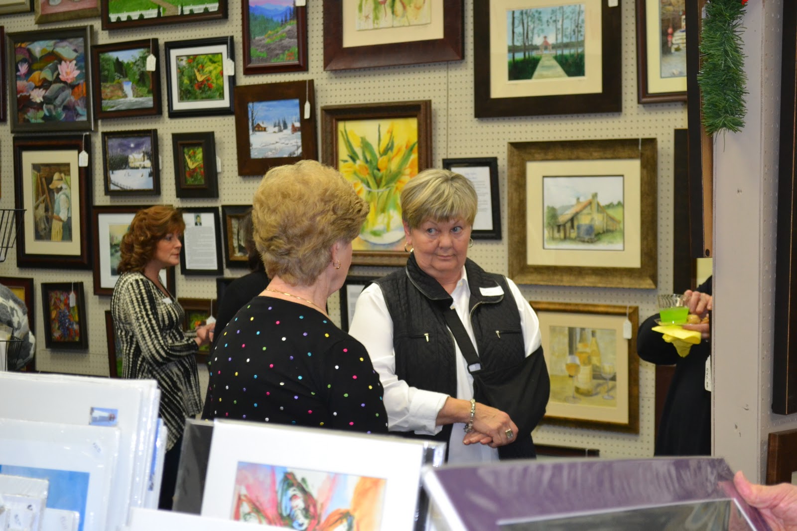
So,  I have been playing. And it's been contagious, because I have others playing now too. Truth be told, I caught this bug after doing some serious research on varied methods for experimental watermedia and it has been the most fun that I've had doing anything in a long time. (except for spending time with my sweeet sweet 5 month old golden retriever, Lily) I am refering to Gelatin Printing. There is something about this process that has just intrigued me. Maybe it's the unpredictable nature of the printmaking process, maybe it's the organic feel to the gelatin plate, but I am hooked, mesmerized and totally in love with the process. And me, a watercolor painter and a pretty representational one at that. Go figure. But art is not restrictive...shouldn't be. And so, the playing, the exploration of other methods and other mediums. Following the muse. 

gelatin monotype on mulberry paper
Now, I haven't done any printmaking since my college days, which was quite a few years ago, but I loved it then. I remember a whole year of walking around with black ink inbedded in every groove and wrinkle in my hands. Oil based ink in those days...hard to get out completely, so you just wore what wouldn't come off. It was ok. Was the badge of being a printmaker. Being more of an illustrator, I gravitated to lithography and intaglio back then. Black and white mostly, occasionally color. But, like I said, I loved it. I enjoyed the process of printmaking. Making gelatin prints is the same, but different. It's just as messy, but since you are using waterbased inks and paints, the clean up is better. Gelatin printing, in my opinion, is a much more organic process and the results are more exciting due to it's unpredictable nature. (as you get used to the process, you can manipulate the outcome a good bit, but the end result is still in large part a big surprise) There are numerous websites and YouTube video's out there on the wild wild web, but the one I found most useful is Linda Germain's website and accompanying blog. She gives full directions for making the gelatin plates (there are many recipes, but hers are the most sturdy, in my opinion). She also has a nice little video showing you the basics of how to go about inking up your plate and pulling your prints.

So. Ready to explore? Go for it. Experiment. Let your hair down and have some fun.


Wednesday, February 29, 2012

Dale Cochran - New Member at Artists Guild Gallery of Greenville

I'm excited to announce that Dale Cochran is our newest member of the Artists Guild Gallery! We will host Dale with a First Friday Opening Reception on Friday March 2nd from 6 - 9 pm.  Please drop by the gallery this Friday evening and join us in welcoming Dale!
http://www.artistsguildgalleryofgreenville.com/

Wednesday, November 16, 2011

Farmers Market Painting - Step by Step update

Continuing with the Step-by-Step blog entries for the Farmers Market painting demo for the Tuesday afternoon and evening class, but making a new entry today. To see the painting in it's initial stages see the following post: http://nancybarrywatercolorblog.blogspot.com/2011_09_01_archive.html

The last 2 weeks have been geared toward completing the Squash paintings. Shown here are mid to late stages on most of the painting. Have begun to add most of the dark recesses behind and between the vegetables and have added several shadows which serves to pull the painting together and to pop many of the objects forward. Finishing details are still yet to be added.

Worked on the purple-ish stem on this particular carnival squash. Typical to the watercolor process, I added the lightest washes first, and then built up the detail and shadows. I might still add some textural effects by 'stamping' with my thumb or index finger picking up some of the ''palette wash' and applying it to the stem. The pigments I used for the stem included: Rose Madder, Burnt Sienna, Cobalt Blue.


I added a cerulean and burnt sienna wash to the top surface of the crate's sides to mimic light reflecting off of the dark black plastic of the crate. I washed in a cerulean underglaze on any of the surfaces that I thought would reflect light, particularly in the corners and crevices of the 'vents' on the sides of the crate and to the inner areas of the handles. After the underglazes were dry, I went ahead and mixed up a thick soupy dark mixture, bordering on the blue/black, and painted the remainder of the crate.  Pigments used to create the blue/black included: french ultramarine, antwerp blue, alizarin crimson and burnt sienna. Lastly, I shadowed the inner areas of the crate vents and handles (not shown in thie view)


To the stem I washed in a cerulean underglaze, let dry and then glazed over this with antwerp blue, rose madder genuine and/or aureolin yellow, depending on whether I needed a purplish or greenish wash, often mingling the 3 directly on the stem. (photo below) Since these pigments are all transparent, non-staining, they do not create 'mud' but a beautiful transparent jewel-like combination. After the second wash was completely dried, I began to 'lift' highlights and details with a clean damp brush. (not shown here)


Added darks between the vegetables using combinations of ultramarine, burnt sienna, and occasionally adding alizarin crimson and/or antwerp to punch up the intensity of the dark. Added shadows behind the slate chalkboard in the top right of the painting to pop the chalkboard forward and push the vegetables back in the composition. Worked on the stems of the spaghetti squash which I will post shortly. Still need to work on pushing several areas 'back' to create more depth and I need to complete the wood surrounding the chalkboards as they are still only showing the initial underglaze. Textural details to the skin of the squash, stems and possibly chalkboards will be added after a final evaluation.

Saturday, November 12, 2011

Frame Warehouse Holiday Open House on Nov. 10th raises over 850 dollars for the Boys Home of the South!

It was a wonderful night at the Frame Warehouse & Gallery Holiday Open House in Greer this past Thursday night! Debbie Beauchemin's never tiring efforts raised over 850 dollars with the final count not in yet. As the economy and in kind donations to charities in general have taken a downturn in recent years, Debbie has risen to the occasion. Each year at the start of the holiday season, she chooses a local charity or organization in need for her Hudson Road shop to raise funds for. In years past, Debbie, who I have a special place in my heart for, has raised several thousand dollars all totalled for organizations such as the Greer Soup Kitchen, the local chapter of the National Association for Mental Illness and this years recipient, the Boys Home of the South. More than 16 local artists, including myself, participated in last weeks fundraiser by donating over $2,000 of artwork and merchandise to the event. Participating artists for this event were: Sandra Roper, Dick Mitchell, Tom Stewart, Edith McBee Hardaway, Michelle Giles, myself (Nancy Barry), Joan Zepf, Sherry Elrod, Stella Schaefer, Judy Taylor, Karl Voss, Andrew and Ruth Banovic, Susan Linn, Richard Campbell, Joanne Reed, Cheryl Bradfute, Danny Carnes, and Gary Roderer.

Artists from left to right: Edith Hardaway (red), Sandra Roper, Nancy Barry

Artists left to right: Danny Carnes (back left of photo), Stella Schaefer (facing)

Artists left to right: Joan Zepf (center)


Artists left to right: Sherry Elrod (back), Judy Taylor (center), Joan Zepf


Left to right: Andrew and Ruth Banovic (left)


Artists left to right: Edith Hardaway (rear left), Joan Zepf, Sherry Elrod and Bill Lester
 As one of the participating artists, I would like to personally thank all of my own friends and family and followers along with Debbie's loyal customers for their generosity and support. We could not do what we do without you.

Thursday, November 10, 2011

Tuesday Afternoon Watercolor Class Pics

Julie and her in-progress painting

Kathy putting some of the finishing touches on her painting.

Bert with her first watercolor painting!
As the holiday season swiftly approaches, the last of my Fall session watercolor classes draws to a close. These photos are just a few from my Tuesday afternoon ladies, who, I have to say, have been a huge amount of fun to work with. Kudos to those in the class who were 'first-timers' to the medium of watercolor! I threw a good bit of information at them and gave them an intermediate level painting subject for their first time out of the gate! Watercolor, when you're a beginner, can often feel like you're tightrope walking without a net, but they handled the process with grace and from what I saw, had a few 'lightbulb' moments along the way. Everyone did a terrific job on their painting. Posted here are 3 of the 5 paintings. Will catch photos of Carol's and Dori's and post an update with their pics next week. Great job all! And thanks to all of you for a very enjoyable 6 weeks!

Saturday, November 5, 2011

Tuesday night watercolor class completed Farmers Market paintings

Here are the completed farmers market paintings from the Tuesday night Fall 2011 class. Photos courtesy of Stella Schaefer.
Radishes and Turnips - Stella Schaefer

Rhubarb - Joan Zepf (almost completed photo)

Japanese Eggplant - Susan Buteau

Rhubarb Study - Joan Zepf

Friday, October 28, 2011

Tuesday Night Painting Class

Stella Schaefer adding finishing detail to painting of radishes and turnips.

Susan Buteau working on a study from the book "Problem Solving in Watercolor"

Joan Zepf discussing her painting with Susan

Thursday, September 22, 2011

Tuesday night watercolor class - Painting in progress


Nov 5 Update: Continuing to develop the painting, I carefully observe the variety of greens and yellows that create unique patterns over  the carnival squash. Using several yellows and a variety of earth tones, I allow the pigments to mingle directly on the paper, rather than overmix on my palette. You can see where I have dropped in burnt sienna and sap green in the warm yellow/gold washes. I continued to develop the green pattern, varying my greens from warm to cool, and again letting many of the pigments marry directly on the paper. I am working here on dry paper, as these patterns are abstract and have crisp hard edges that can only be retained by keeping the paper dry and applying wet washes and pigment directly to the watercolor drawing. I am also keeping the lighting direction, tonal value change and the overall form of the squash in mind as I paint and deepen or lighten the values as necessary.  


Started the Tuesday night Watercolor classes up again for the Fall and have everyone working on a Farmers Market theme. Everyone had a great start to their paintings on Tuesday night and I'm looking forward to seeing the progress of each painting next week. Will take some photos of student work and post when I get a chance. Here is what I am working on and will demo on for the class. At this point, I am just getting started. I laid in most of the soft yellow washes for the squash and have started defining the most prominent object in the foreground, shown in this photo. In the overall shot, you can see that I have also dropped in one of my darkest darks - the chalkboard. Although this is not the darkest dark in this composition, laying it in early in the painting process allows me to really get a handle on the overall tonal value of the painting. In other words, I have something to compare adjacent areas to. I like to get some of my darks in early, rather than waiting till the end. This way, I can work towards the correct tonal values all throughout the painting process and do not have to worry toward the end that I have to make drastic adjustments. For me, it's the way I balance my painting.


Wide shot of painting-in-progress with the inspiration photo taken at the Chicago Farmers Market clipped to board. Note: this is very early in the painting process. Pigments I am using: Raw Sienna, New Gamboge, Aereolin, Quinacridone Gold, French Ultramarine Blue, Winsor Blue, Sap Green, Rose Madder Genuine, Alizarin Crimson and Burnt Sienna.